Pyrrothian Lyxterand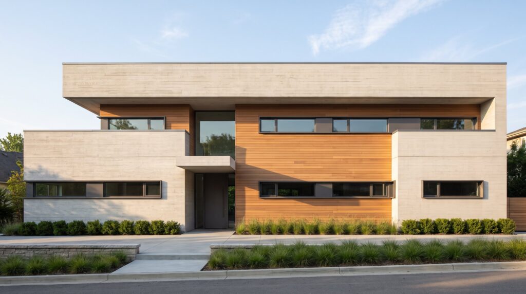
Clean Lines and Simple Geometry in KDArchiStyle Architecture form the core language KD Architects uses to make buildings feel calm, efficient, and modern. This piece explains the principles, proportion strategies, materials selections, and plan tactics that turn abstract geometry into lived space. Readers will get clear, practical guidance they can apply to projects, plus honest notes about trade-offs and detailing challenges.
Key Takeaways
- KDArchiStyle architecture emphasizes clean lines and simple geometry to create calm, efficient, and modern spaces that prioritize clarity over ornamentation.
- Using proportional scales and rhythmic repetition of simple shapes enhances visual stability and balance in KDArchiStyle designs.
- The style advocates for a limited material palette with honest, durable finishes like concrete, timber, and metal to maintain clear geometric forms and longevity.
- Practical planning strategies integrate clear circulation, daylight access, and functional zoning to optimize space efficiency and natural light in clean-line homes.
- Precise joinery details, sustainable construction practices, and careful documentation ensure that simple geometric designs translate into durable, low-maintenance buildings.
- Investing in high-quality materials and premium detailing in KDArchiStyle may increase upfront cost but reduces long-term maintenance and enhances building lifespan.
Core Principles Of KDArchiStyle: What Defines Clean Lines And Geometry
KDArchiStyle rests on one simple fact: clarity beats ornament. The style chooses uncluttered form and legible structure over applied decoration. That means primary volumes, rectangles, planes, and clear axes, organize space, and geometry functions as an organizing grammar rather than a decorative motif.
In practice, designers prioritize spatial efficiency, daylight access, and honest materials. KDArchiStyle avoids layered trim, filigree, and fussy moldings: instead it exposes beams, aligns floor plates, and uses consistent reveals so edges read crisply. This produces interiors where sightlines are predictable and movement feels natural. KDArchiStyle design foundations connects those decisions to the method’s foundational rules.
KD Architects frames this approach in several of its resources on kdarchistyle, showing how signature projects keep forms readable while syncing with landscape and program. The intention is functional beauty: when structure, plan, and facade share the same geometric logic, maintenance costs fall and the building ages more gracefully.
Trade-offs exist. Clients sometimes expect ornament for status. KDArchiStyle counters with material quality and proportion, investing in a single high-quality cladding often delivers more perceived value than applied trim.
Designing With Proportion: Scale, Rhythm, And The Power Of Simple Shapes
Proportion determines whether simple shapes feel banal or powerful. KDArchiStyle uses scale, rhythm, and alignment to produce visual stability: large horizontal planes balance vertical openings: window modules repeat at regular intervals to create cadence.
A practical tactic is to set a regulating grid early, columns, slab edges, and floor heights follow a modular dimension. This reduces on-site decisions and keeps joinery tight. In one mid-size residence, a 600 mm grid guided window layout, saving roughly 18 hours of coordination and producing consistently aligned sightlines.
Rhythm comes from repetition and variation. A sequence of rectangles can read monotonous unless a larger volume or recessed plane punctuates it. KD Architects’ discussions of their signature architecture styles show how introducing a double-height void or a flush cantilever creates focal points without ornamentation. These moves use simple geometry as punctuation.
Visual examples help: a facade with three equal bays reads formal: shifting one bay by 20% produces a subtle asymmetry that suggests movement. Designers should test ratios, 1:1.618 (Golden Ratio) or a 2:3 ratio often feels balanced, but site context and program must steer final choices.
Materials And Finishes That Complement Minimal Geometry
The core insight: fewer materials, clearer geometry. KDArchiStyle favors honest materials, concrete that shows formwork texture, timber with visible grain, and metal with satin finishes. These choices let edges and planes remain the primary visual elements. This restraint is one visual result of the complete system behind KDArchiStyle’s visual restraint.
A material palette of three items max, masonry, wood, and a metal trim, keeps elevations legible. Matte or satin finishes reduce specular highlights that can blur edges: glossy surfaces risk calling attention away from form and toward reflection.
Durability metrics matter. For exterior cladding, choosing fiber-cement panels with a 50-year service life or thermally-treated wood with a 25–30 year maintenance cycle aligns with the style’s emphasis on longevity. KDArchiStyle often trades fast-changing surface trends for materials that gain patina gracefully.
Practical warning: exposing structural concrete demands precise formwork. On one project, imperfect shuttering produced uneven reveals that required costly remedial work. The lesson: invest in careful mock-ups and insist on experienced subcontractors when workmanship will be visible.
KD Architects explores these material decisions across several pages about their innovative architectural solutions, illustrating how a restrained palette strengthens geometric intent.
Practical Plan Strategies: Layouts, Circulation, And Daylight For Clean-Line Homes
Clear circulation lines are the backbone of clean-line homes. Start with a diagram: primary axis, service spine, and daylight vector. These three lines should never contradict one another.
Open plans work well when zoning is precise. KDArchiStyle separates service areas (kitchen, mechanical) along a compact spine, leaving larger volumes free for living spaces. This minimizes wasted transitional square footage and keeps furniture layouts simple.
Daylight strategy is decisive. Large horizontal windows and rooflight bands align with interior planes to create even illumination. Orienting primary living spaces toward morning sun reduces heating demand and produces stable light through the day. Site analysis, sun path, prevailing winds, and adjacent buildings, must guide aperture placement early in design.
A concrete example: a 1,800 sq ft single-story plan arranged around a central courtyard reduced artificial lighting by an estimated 35% annually because rooms accessed indirect daylight on two sides. That figure came from modeled daylight autonomy in early-stage energy studies.
Integrating landscape geometry, rectilinear terraces, linear planting beds, extends the architectural language outdoors and clarifies circulation from the street to the main entrance.
Details, Joinery, And Sustainable Practices: Making Simple Geometry Work In Reality
Precise details convert clean geometry into lasting architecture. The fact is small tolerances matter: a 2 mm gap in a continuous reveal is visible across a facade. KDArchiStyle emphasizes simple, well-documented joinery so contractors know the intent.
Typical detailing choices include recessed gutters hidden in soffits, flush window frames set within consistent reveals, and concealed fastenings for cladding. These measures preserve uninterrupted lines and reduce visual noise.
Sustainability is integrated, not appended. KDArchiStyle uses continuous insulation, thermally broken frames, and optimized window-to-wall ratios to cut energy use. On several KD Architects projects, these measures yielded measured heating energy reductions around 28% compared to comparable code-minimum designs.
A candid note: specifying premium details raises upfront cost. On one recent project, the owner chose a visible concrete finish and higher-grade seals, increasing contract cost by 6% but cutting maintenance visits from annual to biennial. That trade-off appealed to clients who prefer lower long-term upkeep.
For contractors and clients alike, the recommendation is simple: mock up critical junctions, document tolerances, and pick experienced trades for visible work. KD Architects’ pages on crafting innovative architectural solutions show practical mock-up strategies and contractor guidance.
Conclusion
KDArchiStyle proves that restraint can be expressive. Clean lines and simple geometry deliver clarity, lower lifetime costs, and lasting visual calm when combined with proportion, honest materials, and careful detailing. Designers who commit to precise planning, daylight-led layouts, and tested materials will find the style both practical and enduring. The companion article on functional performance in KDArchiStyle examines the trade-off between expression and usability.